Case study
Ritam
Organic honey & beekeeping
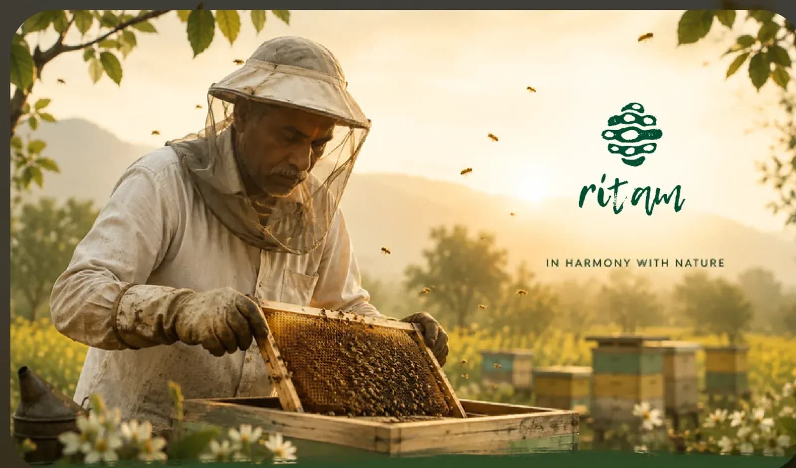
Project overview
- Client
- Ritam
- Sector
- Organic honey & beekeeping
- Disciplines
- Brand Identity · Packaging & Collateral
- Status
- Ongoing
Ritam is a new organic honey and beekeeping company. Rhubarb built its identity from a hand-drawn logo style and symbol system, and continues to work across the range it needs to reach a shelf — packaging, print collateral, digital assets and the website.
01The context
A new company, and everything it needed to be one.
Ritam came to the collective as a new organic honey and beekeeping company — a name and a trade, without the system that turns either into a brand a shopper recognises on a shelf.
A hand-drawn logo style and symbol system, and ongoing work across packaging, print collateral, digital assets and the website.
02The approach
Visual direction
The visual direction includes earthy tones, humane imagery, slightly irregular patterns, and a warm palette to reflect the vibrant world of beekeeping.
Rhubarb Collective, case-study deck, page 17
Memorable for the seasons.
From the deck's own account of the work
03The work
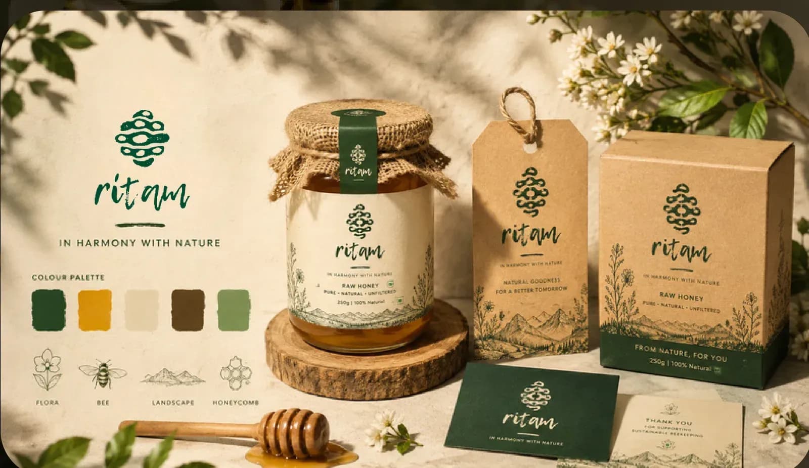
The range
A honey jar, kraft cartons, swing tags and stationery, carrying the hand-drawn mark and the palette across every surface the product is met on.
Where it stands
We are in the process of helping Ritam with their packaging, print collaterals, digital assets, and all kinds of artworks to make this new company truly memorable for the seasons.
The work is ongoing.